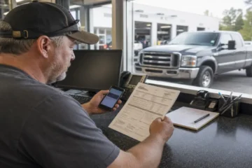

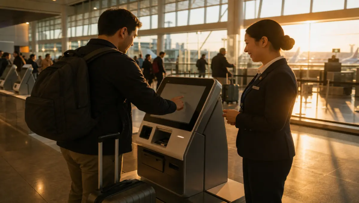
Airports, rail stations, ferry terminals, and similar facilities are under constant pressure to move people through essential tasks quickly. Well-planned travel check-in kiosks can help travelers print documents, pay fares, find information, and complete check-in steps without waiting for a staffed counter.
But speed is only one part of a successful journey. A self-service experience should remain usable when a traveler has luggage in both hands, needs another language, has a low phone battery, is traveling with children, or encounters a system error. The strongest approach gives people an efficient digital option and a clear way to get human help.
Why Self-Service Needs A Better Balance
Self-service can reduce routine queues and free employees to handle exceptions, changes, and travelers who need personal assistance. However, a shorter line does not automatically mean a better experience. If a traveler completes one step quickly but gets stuck after a failed bag tag scan or rejected payment, the facility has only moved the delay to a different point in the journey.
The goal is choice, not forced automation. Travelers should be able to use a phone, a kiosk, a staffed position, or a combination of those options. A system earns trust when it lets people complete simple tasks independently while making recovery easy when the process does not go as planned.
What Travelers Expect
Travelers expect information to remain consistent across a website, mobile app, counter, display, and self-service device. They also benefit from practical options such as digital or printed receipts, multiple payment methods, multilingual instructions, and timely updates when gates, platforms, schedules, or boarding details change.
Operators should review each service through a simple traveler-first checklist:
- Can a first-time visitor finish the task without needing to ask what to do next?
- Can the journey continue if the traveler has no smartphone, limited data service, or a dead battery?
- Can the person switch to staff assistance at any point without starting over?
Design For Real-World Use
Travel environments are busy, noisy, and often stressful. Interfaces must work for people carrying bags, watching children, managing a tight connection, or reading in a second language. That calls for short instructions, large touch targets, readable text, strong contrast, and a visible indication of progress.
Place common actions first. “Check in,” “print ticket,” “pay,” “find my gate,” or “get help” should not be buried under several layers of menus. Use calm, direct wording when a transaction fails. Rather than displaying an unexplained error code, explain what happened and offer a specific next action, such as trying again, changing payment method, or speaking with an attendant.
Testing should include real travelers, not only project teams who already understand the system. Observe where people pause, select the wrong option, abandon a session, or look around for help. Those moments usually reveal more useful design changes than adding longer instructions.
Make Accessibility Part Of The Plan
Accessibility cannot be a final-stage adjustment. It should shape equipment selection, placement, interface design, wayfinding, staff procedures, and maintenance plans from the beginning. The ADA design standards for transportation facilities and operable parts provide an important reference when teams evaluate physical access and controls.
A more inclusive setup may include reachable controls, room for mobility devices, audio guidance, tactile features, captioned help, screen-reader-compatible digital tools, and clear space around equipment. Consistent placement also matters. Travelers should not have to search every concourse or platform area to find a usable service point.
Accessibility Review Questions
- Can a wheelchair user reach every control required to complete the task?
- Can a traveler with hearing loss receive instructions and request assistance?
- Can a person with low vision distinguish important actions and status messages?
- Is help available without requiring the traveler to leave the service area?
Keep Human Help Within Reach
Automation works best when it supports employees instead of trying to eliminate every interaction. Staff can spend less time on straightforward transactions and more time resolving disruptions, supporting unfamiliar travelers, and handling situations that require judgment.
Make help visible before a problem occurs. Use clearly marked assistance buttons, easy-to-find staff locations, remote support where appropriate, and an escalation path that does not force someone to repeat every step. Travelers should never feel blamed for needing assistance. Every automated task needs a clear recovery path.
Protect Privacy And Payment Data
Travelers may enter reservation details, identity information, payment data, or contact information in public spaces. Operators should use plain-language notices before collecting sensitive information, provide screen privacy where practical, end inactive sessions automatically, and remove personal details from the display as soon as a session is complete.
Privacy should be treated as an operating practice, not just a legal notice. The NIST Privacy Framework offers a useful structure for identifying privacy risks and managing them as systems, vendors, and traveler services change. Equipment should also be tested in crowded conditions, where someone may be standing close enough to view a screen or overhear instructions.
Measure The Right Results
Usage totals are useful, but they are not enough. Track completion rates, failed attempts, average task time, help requests, abandoned sessions, repeat errors, and the reasons people move from self-service to staff support. Review results by location, time of day, language, task type, and traveler needs where that can be done responsibly.
Pair operational data with short traveler surveys and employee feedback. A queue may look shorter while frustration increases elsewhere. For example, a system may redirect unresolved travelers to a distant counter, creating a hidden delay that basic kiosk usage reports do not show.
A Practical Rollout Plan
- Map the journey. List every step from arrival through departure or exit.
- Find pressure points. Identify long queues, repeated questions, and common mistakes.
- Choose one focused task. Begin with a process that has a clear purpose and measurable outcome.
- Test with varied users. Include families, older adults, visitors, people with disabilities, and people who use different languages.
- Add human backup. Define who helps, where they are located, and how quickly they can respond.
- Launch in stages. Pilot the experience in one location before expanding it.
- Improve continuously. Fix confusing steps, recurring failures, and unclear messages based on real use.
Common Questions
Does self-service always make travel faster?
No. It can save time when the process is reliable and easy to understand. Slow equipment, unclear instructions, or missing support can create new delays.
Should every traveler be required to use a digital option?
No. A resilient service model provides options. Some people prefer mobile tools, while others need a printed document, a kiosk, or help from an employee.
What should happen when a system fails?
The traveler should receive a clear message, a useful next step, and a fast route to assistance. A vague error code is not a recovery plan.
Conclusion
Travel hubs can make self-service faster without making the journey colder or harder. Simple design, accessible placement, thoughtful privacy protections, flexible payment choices, and visible human support create a system that gives travelers more control. The objective is not to remove every personal interaction. It is to make routine tasks easier while ensuring help is always within reach.